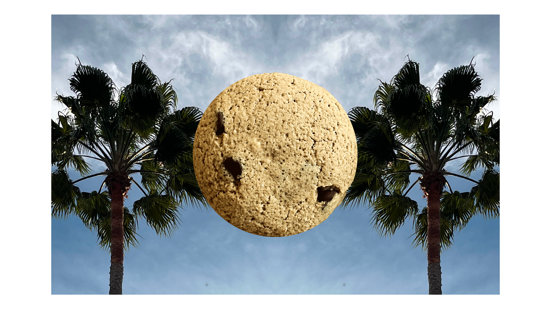
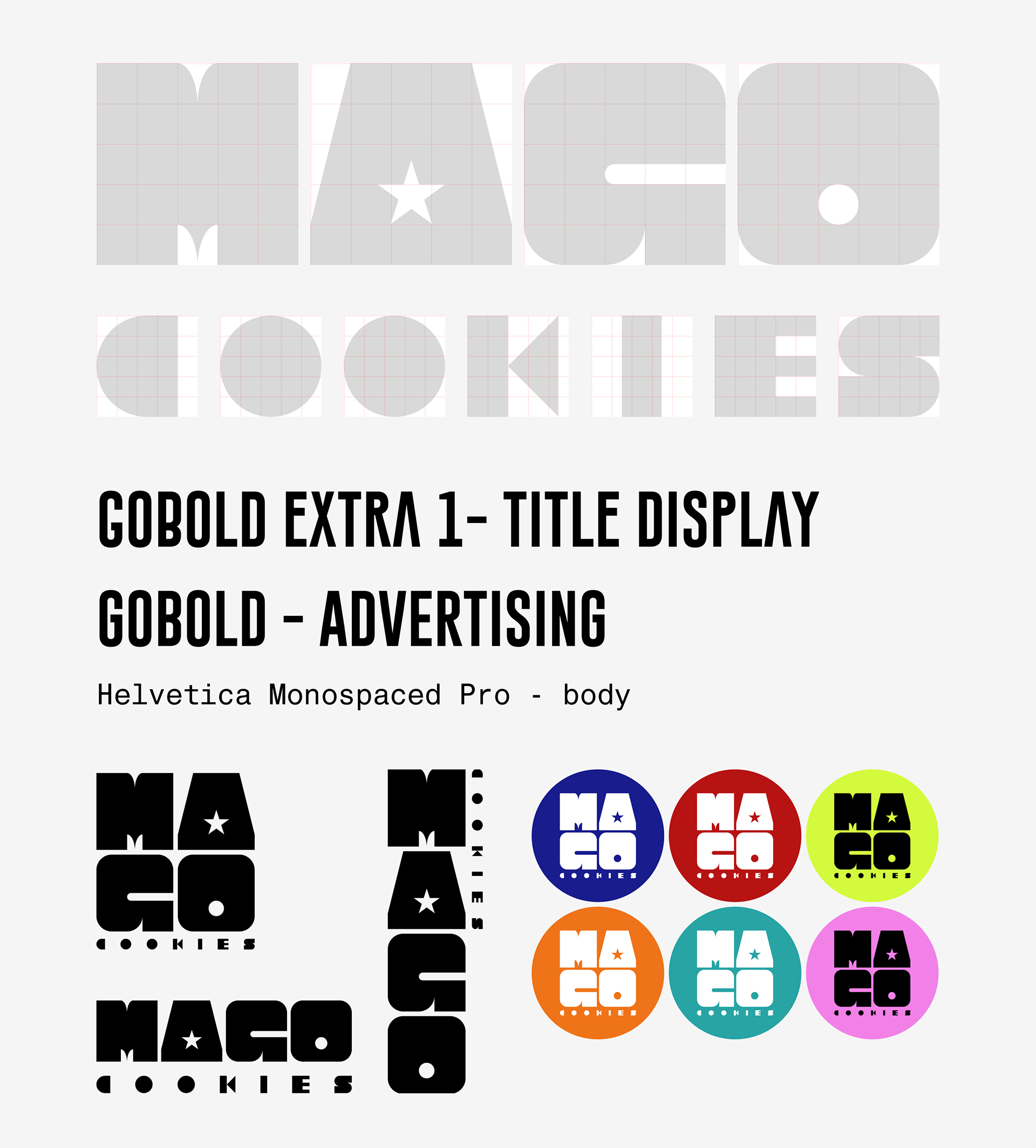
I had the pleasure to fully design and brand the MAGO cookies brand.Since the word is akin to magic I devised visuals that reflect general wizardry imagery such as the star, moon, and orbs. Below is the Logo design and brand colors along with typeface chosen for the design system.
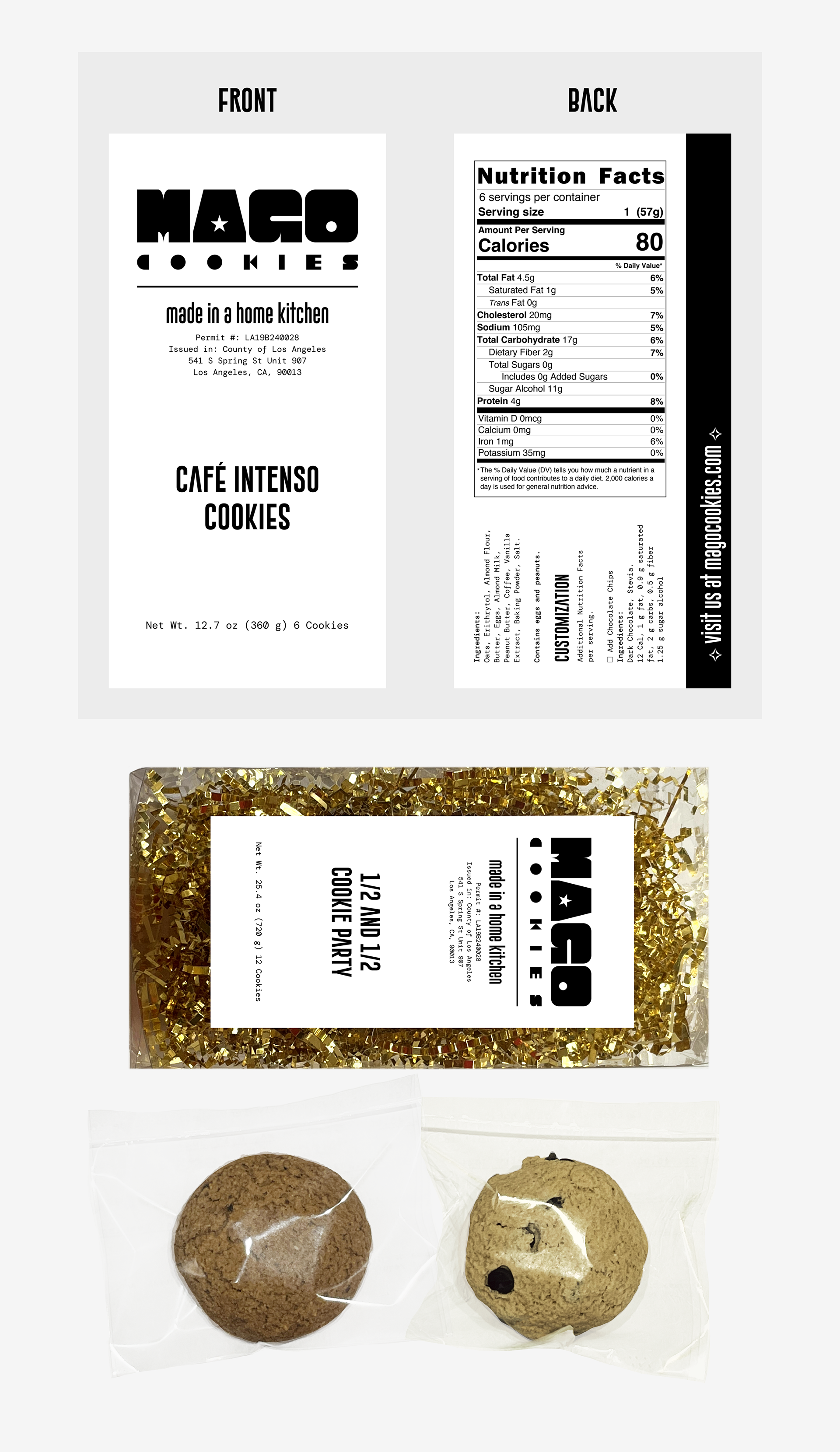
For packaging there was a lot of information to fit into the front and back label and even though it seems very clean and light, the label is packed with information about the product. I decided to have these printed with a pearlescent finish for a premium experience and luxe appeal. To add to the practicality and enhance the mood, I chose to pack the cookies themselves around golden crinkle paper. The box is reminiscent of a small bakery box although its is made of plastic so you can see the product displayed.
Since the company only operates in CA, I decided showcasing what California is known for would be best to build a sense of familiarity and camaraderie. The visuals are saturated and vibrant just like the San Francisco and Los Angeles giving an ode to the sunny state and its complex culture.
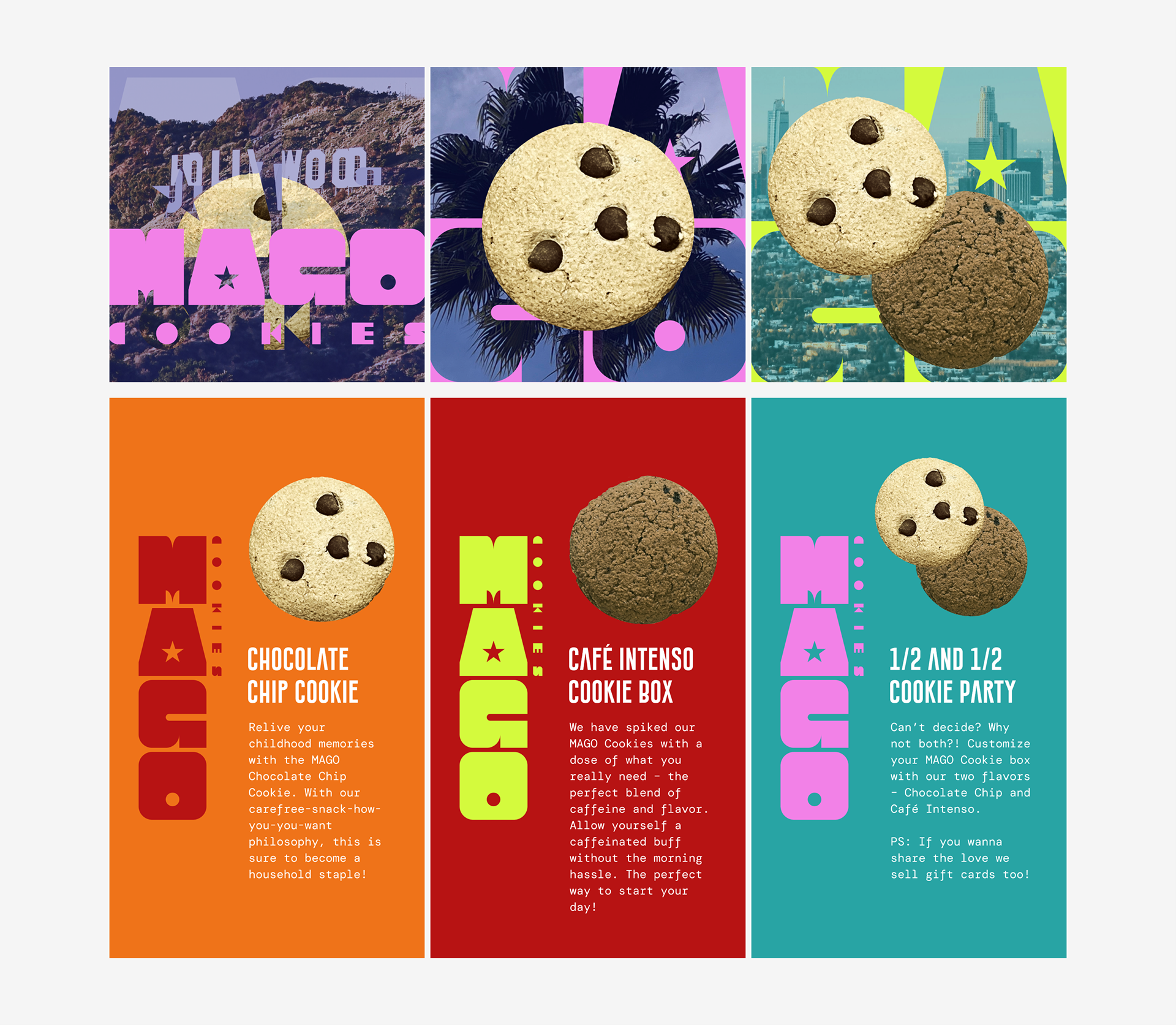
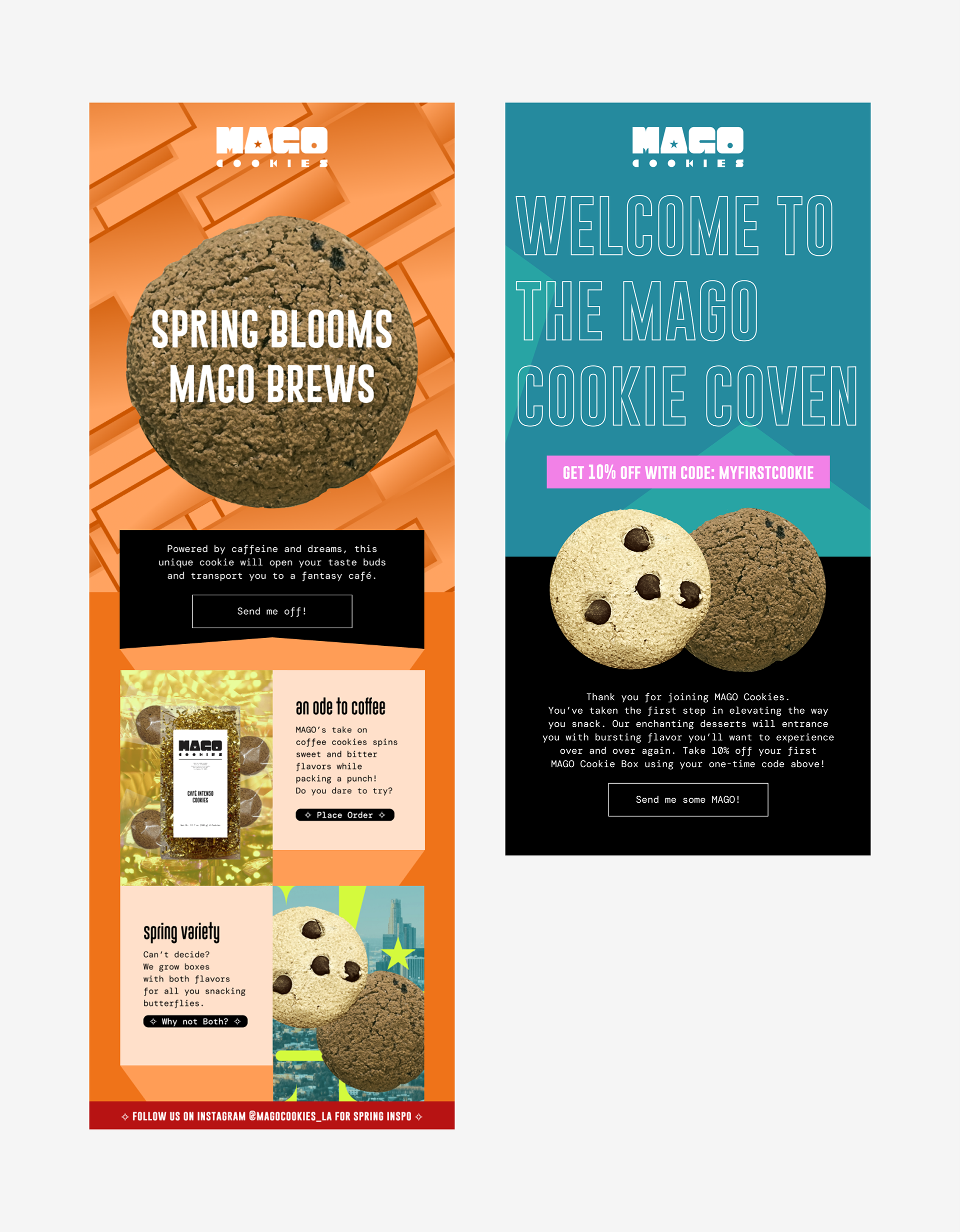
Marketing channels include fresh visuals for e-mail and social that further build the brand reminding customers of its premium and luxe experience.